(solution 01)
Make the final grade visible
Before
After
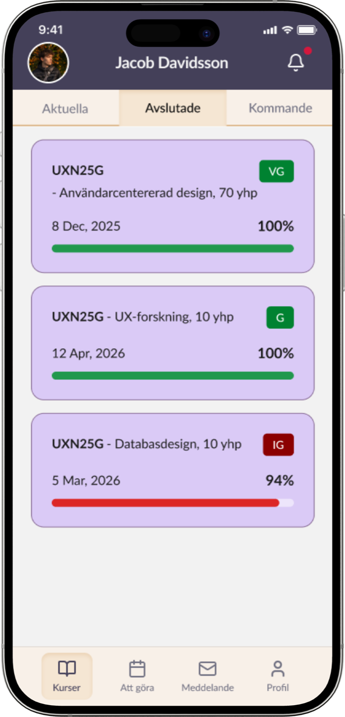
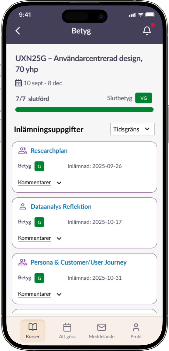
From 1 in 5 to 5 in 5: redesigning the Itslearning mobile app so students can actually find their final grade.
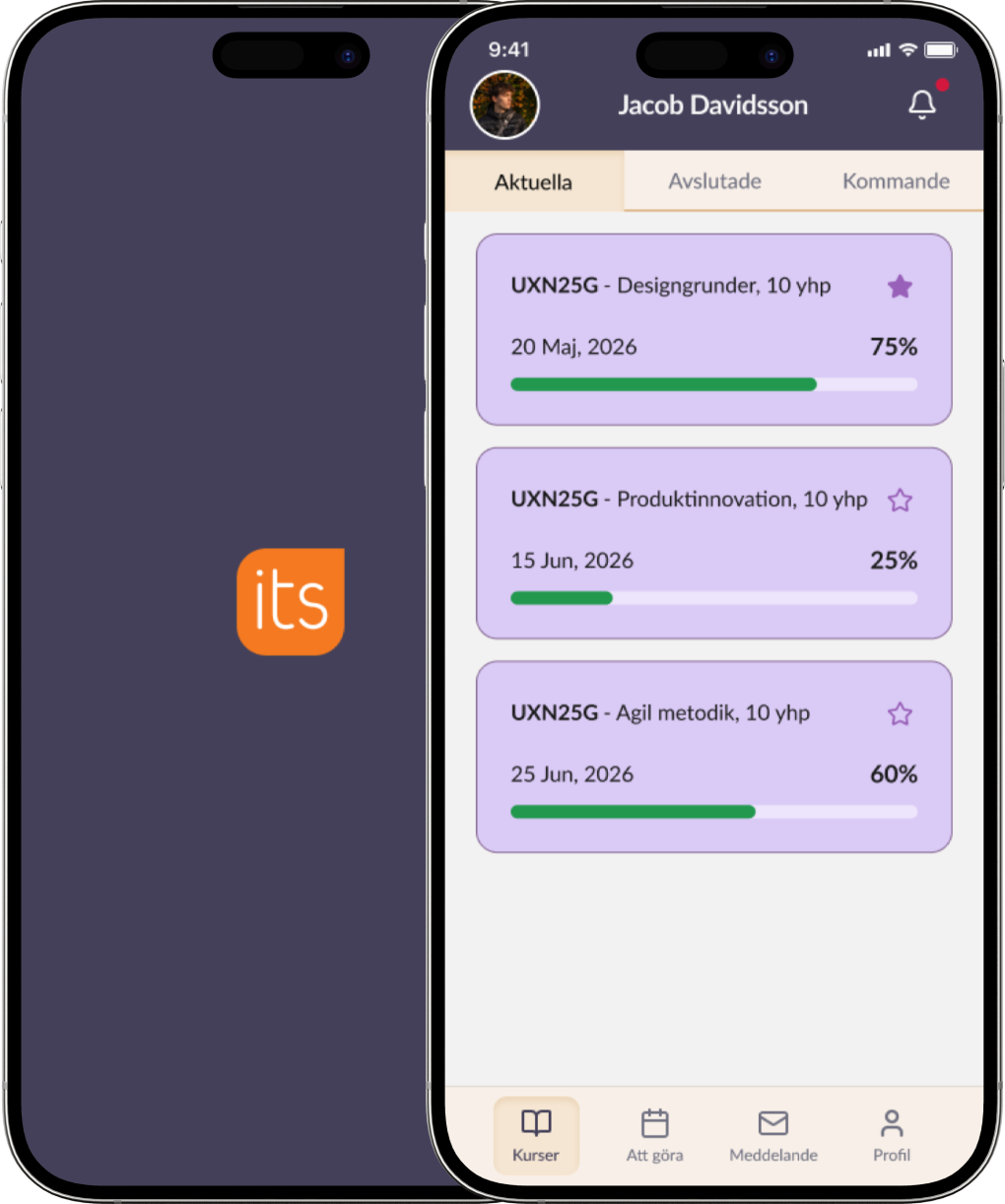
(an app students avoid)
(the context)
Itslearning is a learning management platform described as designed primarily for teachers. Students are at least as large a user group, and as students ourselves we noticed we avoided the mobile app and used the desktop version instead.
As product strategist, I convinced the team to choose the product and set our direction: solve real problems students face every day, well enough that we could present the solutions to Itslearning itself.
(baseline test)
Five students searched a completed course for its course plan, an assignment grade and the final course grade. Everyone found the first three, by different routes, but the final grade was another story.
1/5
found the final course grade
4:53
minutes on average for the scenario
3.2
misclicks on average
1/5
average rating for ease, clarity and satisfaction
“I think there should be a tab, so it’s clear where I can see my final grade.”
“Planning and content are sometimes kind of the same thing.”
(what was broken)
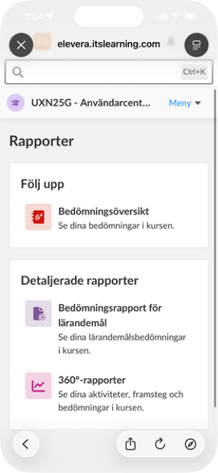
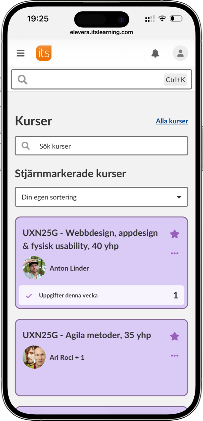
Grades were buried under “Rapporter”, or at the very bottom of an overview page.
The hybrid app kept sending students to external browser views with no easy way back.
“Planeringar” and “Innehåll” overlapped, and the same documents lived in several places.
The app was in English and the web in Swedish, and versions differed between devices.
(validated with five new students)
(results)
5/5
found the final course grade(up from 1/5)
1:25
minutes on average(down from 4:53)
0
misclicks(down from 3.2)
4.8–5
out of 5 for ease, clarity and satisfaction(our goal was 3)
4 of 5 participants called the app “very clear” and all five called it “very easy” to navigate and said they were “very satisfied”.
“The layout is very clear, and it’s very clear what the different parts are for. I think it’s very simple.”
“The previous version isn’t even really an app, it just takes you to the browser. This feels like something you could actually use more often.”
(try it yourself)
These are the same four tasks our test participants did. In the old app, only 1 in 5 managed the last one. See how long it takes you in the redesign.
(opens the interactive Figma prototype)
(how we got there)
(research)
We started from a heuristic evaluation based on Nielsen’s principles and an impact map with seven personas, from the busy student asking “Where is my final grade?” to a student with dyslexia and a teacher. Our goal: more engagement with the mobile app and less frustration, measured by clicks, time on task and a satisfaction score of at least 3 out of 5.
I suggested testing one short user flow twice: first timed and silent for task success, errors and first clicks, then thinking aloud for the why. It gave us both numbers and insight from the same five sessions.
(redesign)
(solution 01)
Before
After
(solution 02)
Before
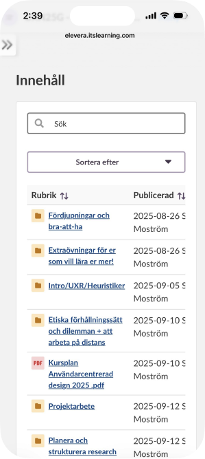
After
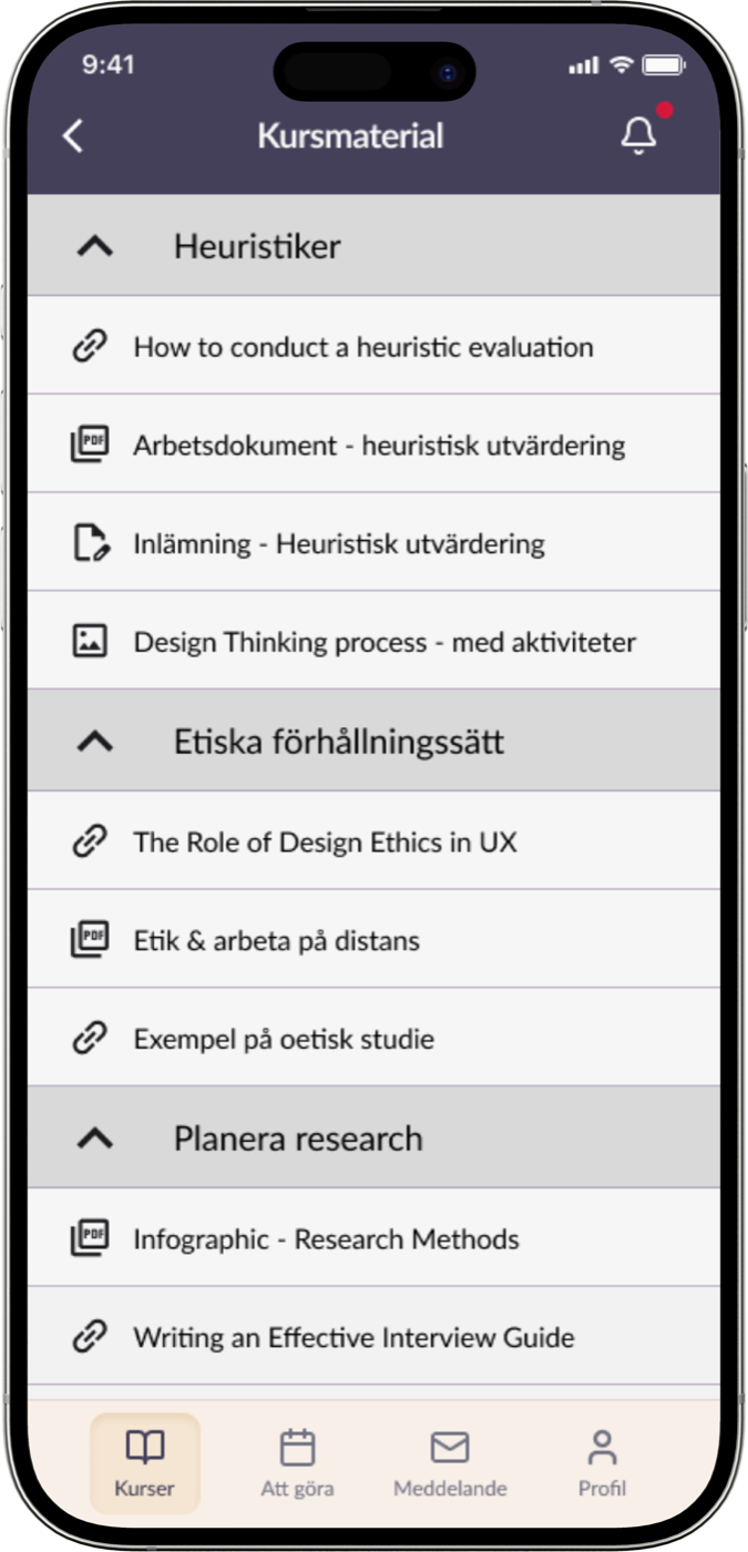
(solution 03)
Before
After
(design details)
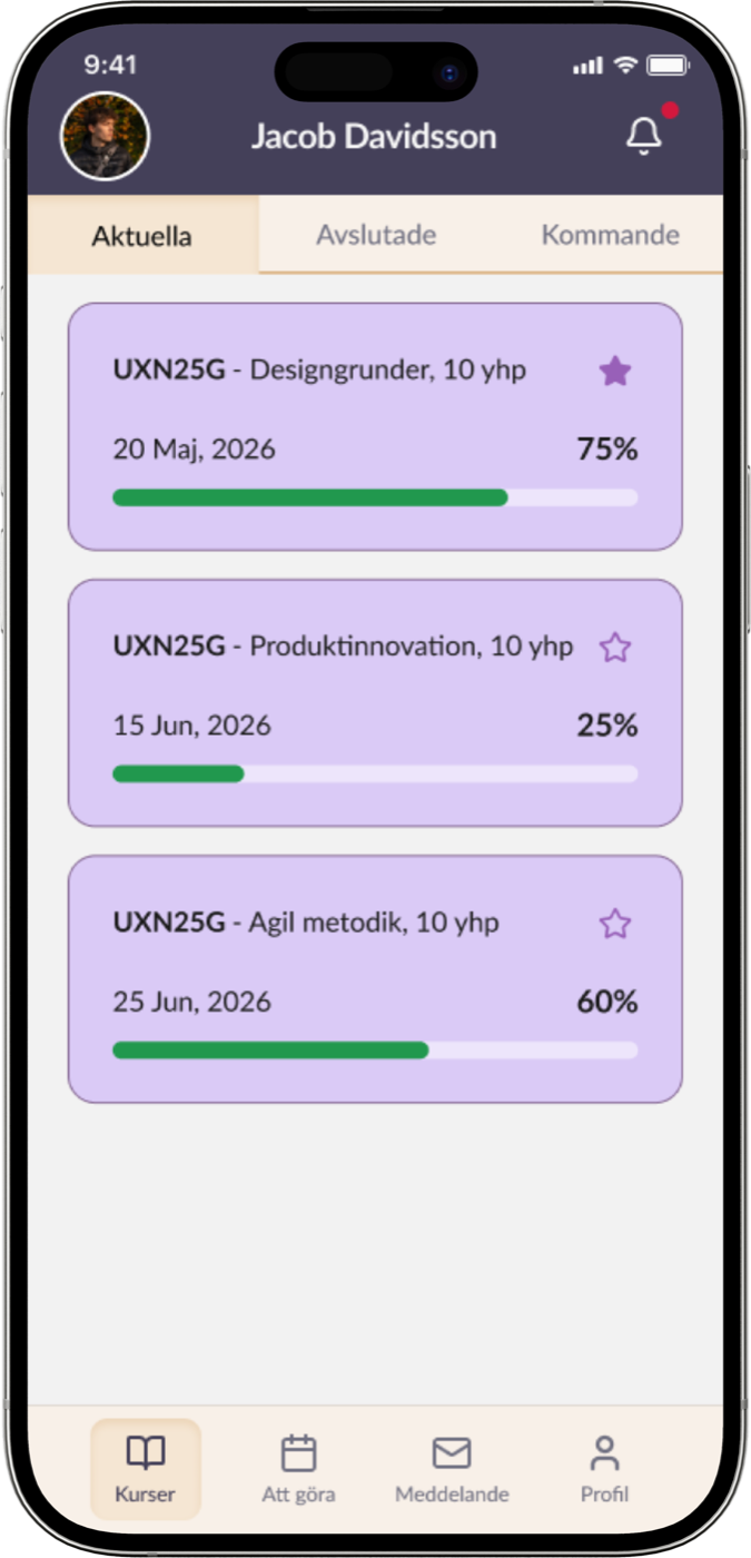
The redesign follows Itslearning’s brand guidelines, colours, icons and the Lato typeface, with contrast ratios of at least 6.48:1, a minimum text size of 16px, large touch targets and a consistent layout across every screen.


Aa
Lato Regular
Lato Medium
Lato Bold
ABCDEFGHIJKLMNOPQRSTUVWXYZÅÄÖ abcdefghijklmnopqrstuvwxyzåäö .:;!?”#¤%&/()=><{{[]}€£$@ 1234567890
Push notifications were one of the most requested features, but we deliberately scoped them out: we couldn’t solve every problem at once.
(my role)
As product and UX strategist I chose the product, set the vision and kept the scope focused on the flow with the biggest pain.
After the baseline test we discovered that participants had used two different app versions, which skewed the results. I suggested a team retrospective, we investigated the versions across devices, and for validation we recruited only users of the older version, so the comparison would hold.
(reflection)
Check app versions and devices before testing, not after.
“We can’t solve every problem at once” made the redesign sharper.
Students find it less useful when teachers spread information across Teams and email. Teachers are the next study.
Next steps: usability studies with teachers and educators, testing a dashboard and progress feature, swipe gestures in the prototype, and simpler document previews.