Lillhagens Mikrobageri
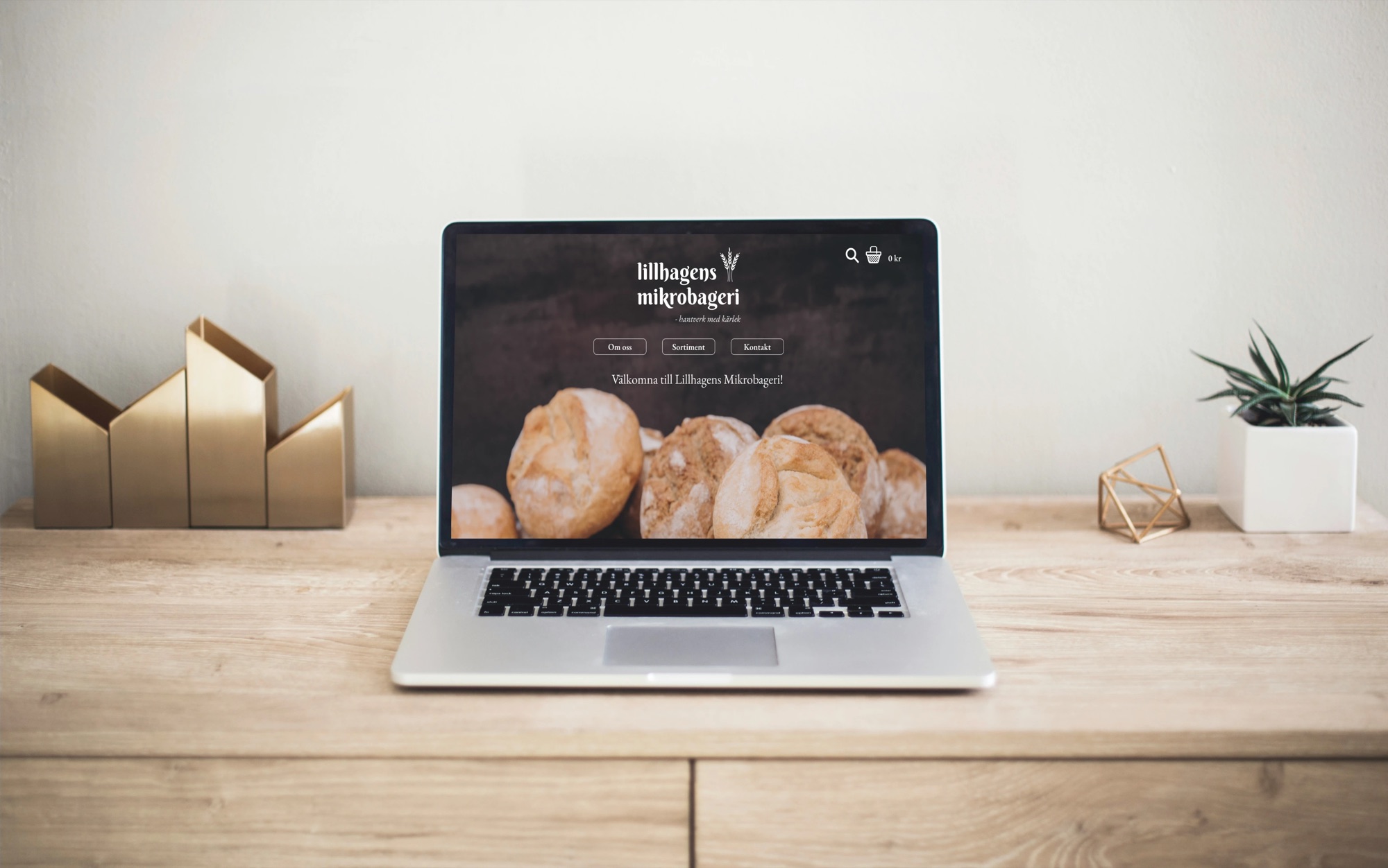
Redesigning my own bakery’s website with a more user-centric approach.
- (duration)
- 2 weeks
- (my role)
- UX Designer
- (focus)
- Web redesign, online shopping experience
(project context)
A home bakery, online
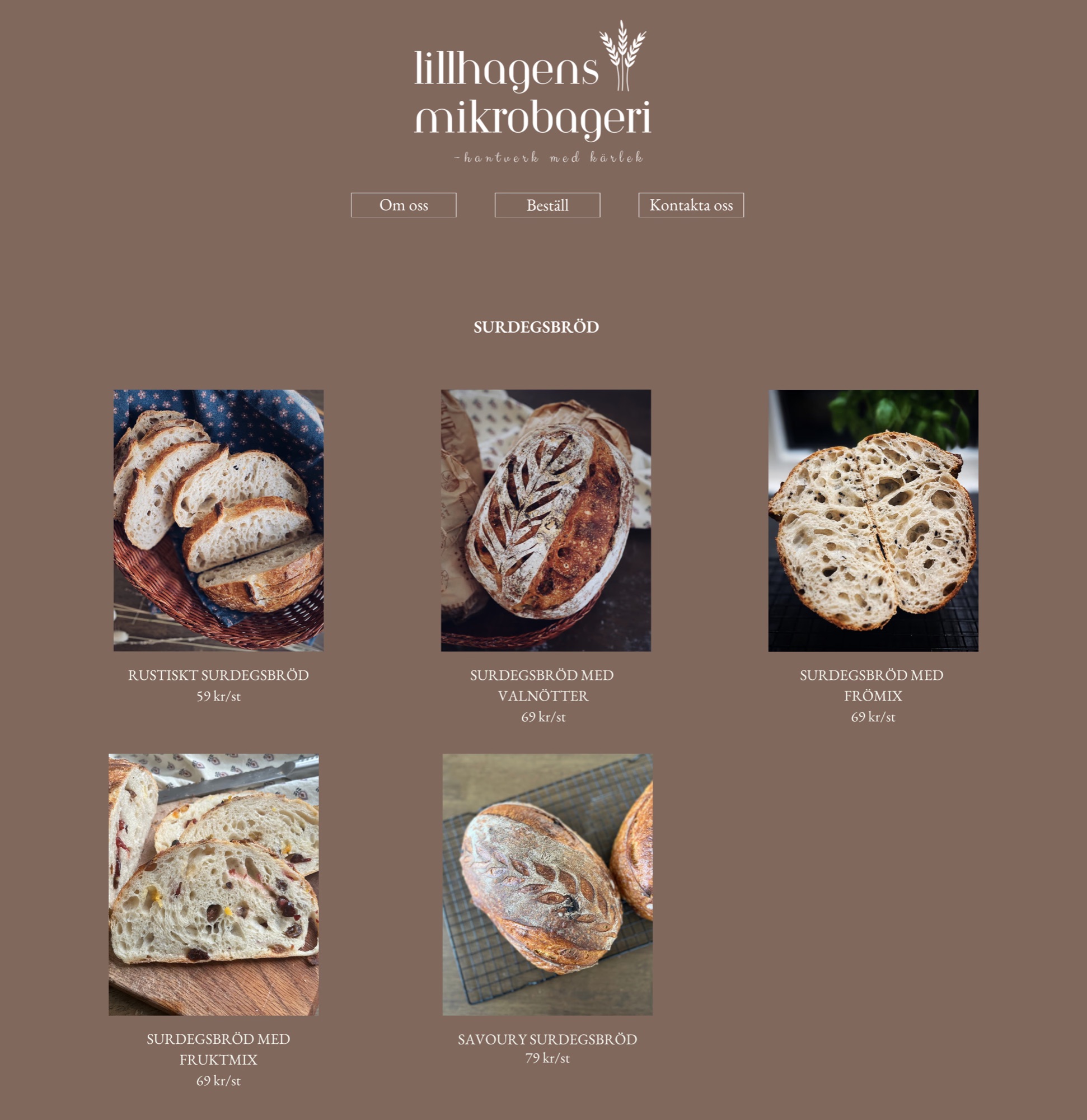
In 2024 I founded Lillhagens Mikrobageri, a boutique home bakery in Lillhagen, with a simple Canva website as a digital catalogue.
It showcased my products and met Livsmedelsverket transparency rules, but offered no direct communication or e-commerce.
(the pivot)
A fragmented journey
After moving into UX, I revisited my business’s touchpoints. Customers had to leave the site to order via Instagram or email, then pay via Swish, creating friction and drop-offs.
This proactive redesign turns a static information hub into an end-to-end shopping experience.
(audit)
Pain points
Fragmented conversion
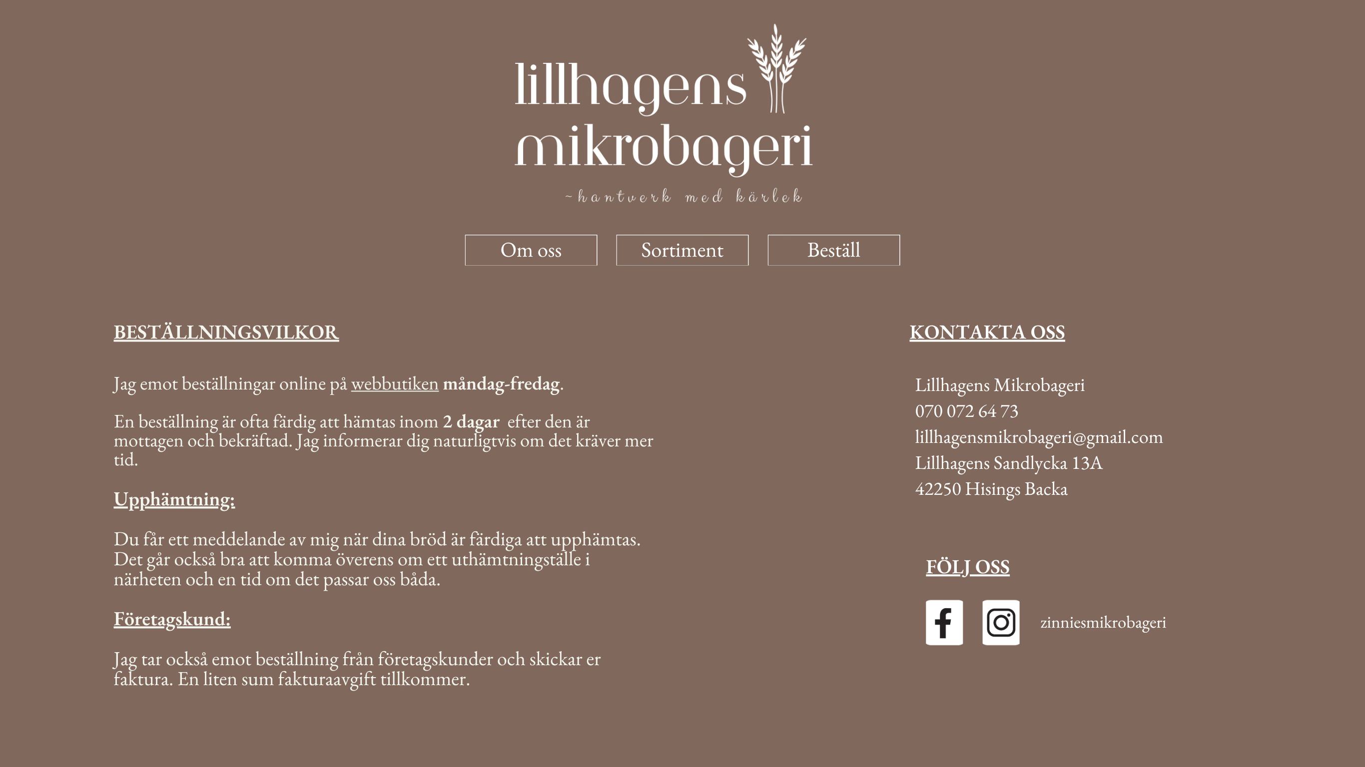
No direct order or contact button; users jumped to social media.
Visual hierarchy
Cluttered info hid storage instructions and allergens.
Manual effort
Orders relied on back-and-forth messaging.
(the new version)
From cart to confirmed
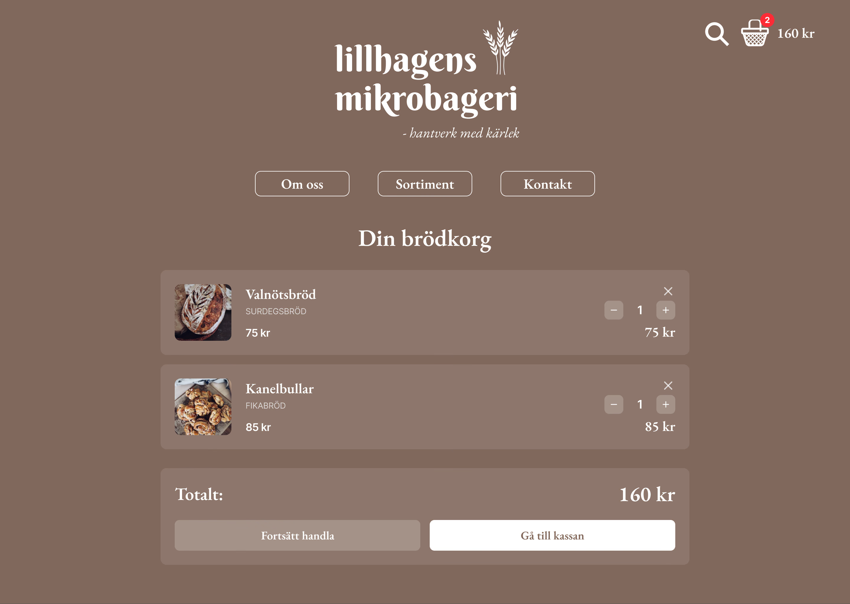
A checkout flow from cart to payment, including Swish, Sweden’s most trusted mobile payment method, plus card options. A familiar mental model reduces checkout anxiety.
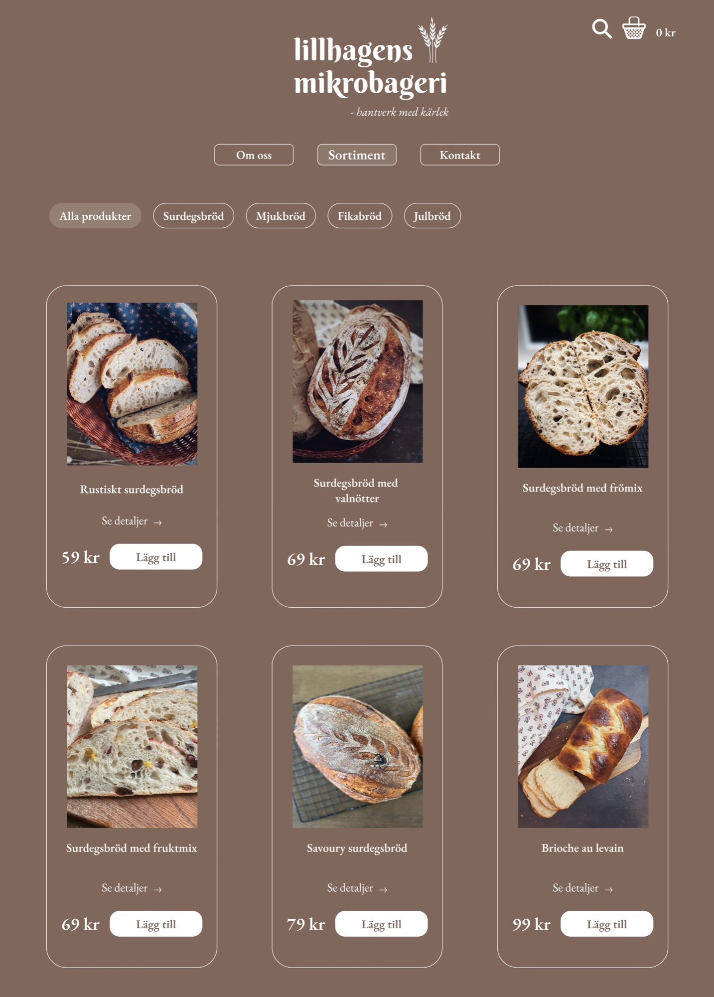
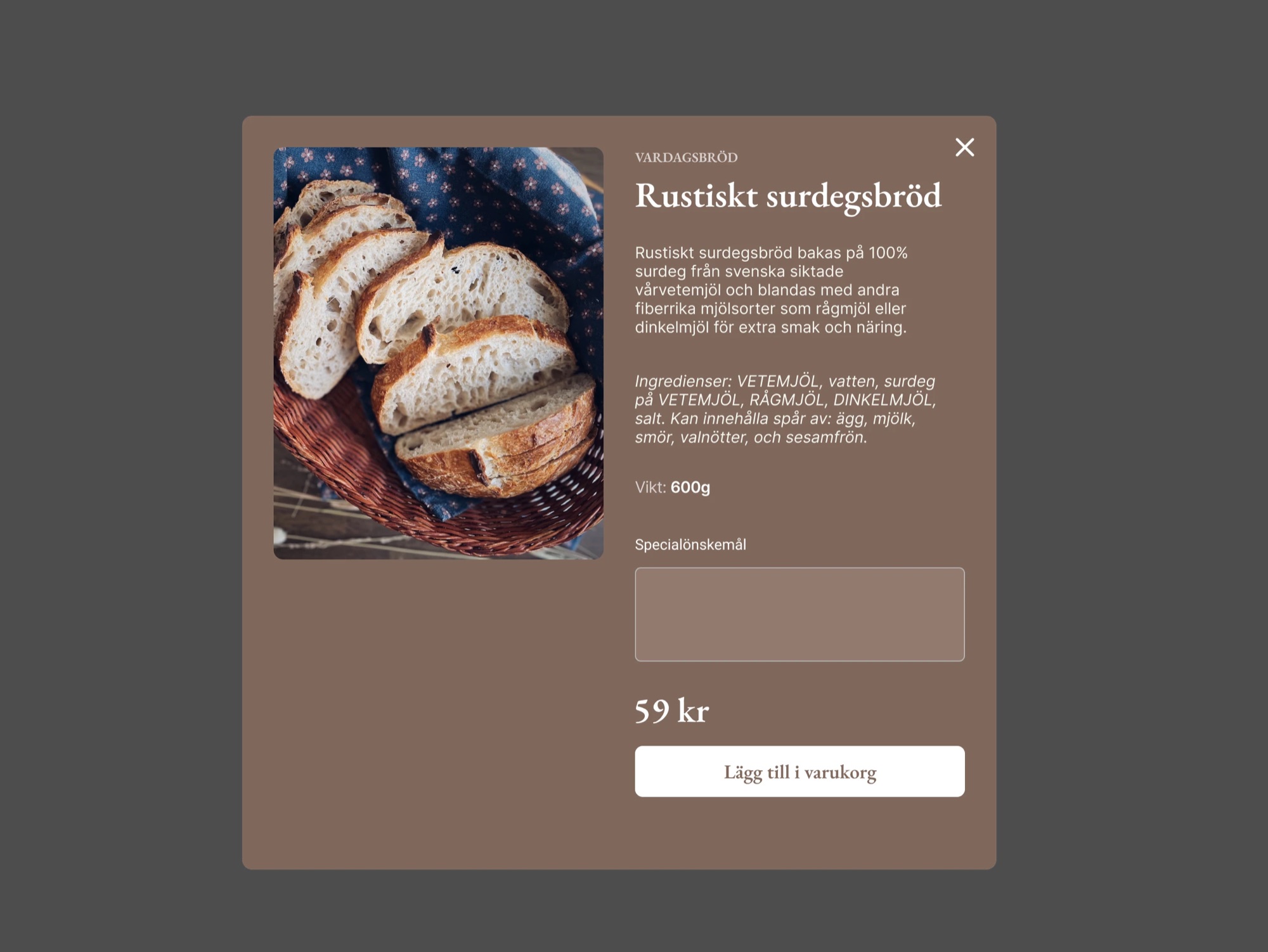
Cleaner product cards, a filterable Sortiment and a “Special request” field to message the baker. Product info follows Livsmedelsverket standards in a calmer layout.
(visual identity)
A UI refresh
- Logo redesign: simplified for scalability and recognition.
- Intuitive navigation: familiar icons for basket, search and arrows.
- Clear hierarchy & CTAs: distinct primary and secondary buttons.
- Typography: EB Garamond for headings, Inter for UI and body.
- Crust#545454
- Rye#80685C
- Flour#FFFFFF
- Oat#99867D
(reflection)
Conclusion
Key achievement
A static digital menu became a fully functional e-commerce concept.
The power of UX
A beautiful website is useless if users don’t know how to buy.
What I’d do differently
A/B test whether the special-request field affects conversion.
Final thought
The bakery has closed, but this redesign keeps its spirit alive.